02 / Commercial · Landing pages
Landing pages built from the same brief as the ad.
Most ads lead to a page that was written for someone else. We build the landing page from the same brief as the ad, so the visitor lands on the promise they tapped, and we test the ad and the page as one journey: the baseline, the creative effect, then the page effect, measured on purchases.
What a paid-traffic landing page is
A paid-traffic landing page is a page built for the people who arrive from one ad, or one family of ads. It opens on the promise that ad made, answers the questions that promise raises, and asks for one action. A product page is built for everyone who might reach a product, from search, email, the homepage or a shared link, so it has to answer every question at once.
Both pages have a job. The expensive mistake, in our view, is sending a specific ad to a general page. The ad spent its first second making one promise; the product page opens on a gallery, a price and a size picker, and the visitor has to find the promise again on their own. We wrote about why this is the most common defect we find in live ad libraries in Landing page vs product page.
| Paid-traffic landing page | Product page | |
|---|---|---|
| Written for | The people one ad or concept brings in | Everyone who reaches the product |
| First screen | The ad's headline, visual and offer | The product, the price, the options |
| Actions on offer | One | Many (browse, compare, add, share) |
| When the ad changes | The page can change with it | The page stays the same |
Why message match matters
Message match means the visitor lands on the promise they tapped. The platforms say this plainly.
Google's advice to advertisers is that "when someone clicks on your ad, they expect to land on a page that's relevant to what they saw in your ad. If they don't immediately find what they expect, they're more likely to leave." It tells advertisers to "choose a landing page that closely matches your ad and keywords" and that the page "should also mirror the call-to-action in your ad text." Its own example: if the ad promises shoes at 20% off, "customers should be able to find and buy shoes at that discounted price on your landing page."
Google also scores this. Landing page experience is defined as "how relevant and useful your landing page is to people who click your ad," and it is one of the three components of Quality Score. Google is careful to add that Quality Score "is not an input in the ad auction"; it is a diagnostic. We read it the same way: a warning light, not the goal.
Meta's guidance points the same way. Meta's own policy pages did not load for us, so these are the three tips Meta gives under its Low Quality or Disruptive Content policy, as quoted by Jon Loomer on jonloomer.com: "Link to landing pages that include a significant amount of original content relevant to the ad" and "Minimize the amount of content that blocks or prevents people from viewing the original text on the landing page." Back in May 2017, Facebook said that if a post might link to low-quality web pages, it "may not be eligible to be an ad."
The point we would add: these platforms judge the page from the outside. Your customer judges it in the first screen. If the ad said "replaced 14 pills", the page has to open on that, not on a mission statement.
Speed
A matching page that loads slowly still loses the visitor. Google's mobile advice is short: "Keep it quick." Its web.dev guidance gives the thresholds most teams use: Largest Contentful Paint "within 2.5 seconds of when the page first starts loading", Interaction to Next Paint of "200 milliseconds or less", and Cumulative Layout Shift of "0.1 or less", measured at "the 75th percentile of page loads, segmented across mobile and desktop devices."
In 2017, when Facebook began taking "the estimated load time of a webpage" into account in mobile News Feed ranking, it cited the figure that "as many as 40 percent of website visitors abandon a site after three seconds of delay." That post was about News Feed links, not ads, but the direction has not changed.
Our view: the page an ad leads to should be lighter than the store around it. No carousel above the fold, no third-party script that does not earn its weight, and the hero image sized for a phone.
Mobile
Google reminds advertisers that "many of your customers will be visiting your website on a mobile device. On a smaller screen, it can be hard for people to find what they want." Its guidance for that screen: "put important information towards the top of the page", "use simple navigation", and "avoid cluttering your site with too many ads or pop-ups."
Our view: design the phone screen first. The first screen carries the ad's promise, one proof and the action. Everything else (ingredients, sizing, reviews, delivery, returns) sits below in the order the ad's promise makes someone ask for it.
What good looks like
Each ad makes a specific promise, and the page's first screen should be built around it. Some examples from our showcase:
- Replaced 14 Pills and Takes 2 Seconds, a UGC ad for HealthyCell, puts a simplicity promise in its title. The page it leads to should open on that same comparison, not on the full product range.
- What's my Hair Type, Actually, a UGC ad for Prose, is framed as a question. A page that answers it, or starts answering it, keeps the thread the ad started.
- 12 Hours Later, a UGC ad for Mandala Scrubs, is named for a moment rather than a product. The first screen should stay in that moment rather than reset to a catalogue.
- 1 for 1, a studio UGC ad for Red Lobster, carries a deal in its title. When the ad is an offer, the offer is the headline of the page.
None of this needs a new website. It needs a page per promise, which is cheap once the brief already exists. More in A hook is a promise. Most landing pages break it.
How Flixr does it
We make the landing page from the same brief as the ad, alongside the video, UGC, motion, statics and end cards. The headline, the visual and the offer the ad showed are on the first screen of the page.
An engagement starts with read-only access to your results and ad accounts, so we are judged on the same numbers as your team. The first month is spent moving in: reading 90 days of your ads one by one, a gap analysis of what works and who you do not reach yet, then the first three hypotheses go live and the logbook opens. Flixr Studio, our own tool, tracks the ads running in your category on AppLovin, Meta and TikTok, and calls the winners by what the networks keep funding, so the page brief starts from what is lasting in your category. After that the loop runs every week: brief, make, launch, read, log.
We can start from your existing ads. The page is built to match an ad, so there has to be one.
How to measure it
The question every brand asks is whether a lift came from the ad or from the page. We answer it with a test in three steps, each changing one thing:
| Step | What runs | What it tells you |
|---|---|---|
| 1. Baseline | Existing ad to existing page | Where you are today |
| 2. Creative effect | New ad to existing page | What the new ad does on its own |
| 3. Page effect | The same new ad to a matching new page | What the page adds on top |
All three are read on purchases, revenue and ROAS, not clicks. Google defines a ROAS target as "the average conversion value (for example, revenue) you'd like to get for each dollar you spend on ads", and that is the ratio we compare across the three steps. A page that raises clicks and lowers purchases has failed, however good it looks.
The full method, with the audit we run on the ad-to-page handoff, is in Landing page vs product page for paid ads. Why we judge creative on purchases rather than on the ad is in Measure creative on purchases, not on the ad.
What you get
The same promise
The headline, the visual and the offer the ad showed, on the first screen of the page.
Built for the phone
A light page with the promise, one proof and the action at the top, and the rest below in the order the ad makes people ask for it.
A test that separates ad from page
Existing ad to existing page, then new ad to existing page, then the same new ad to a matching new page.
Measured on purchases
Purchases, revenue and ROAS, not clicks.
How it runs
One loop, every week.
- 01 Read Read-only access to your results and ad accounts, so we are judged on the same numbers as your team.
- 02 Brief A gap analysis of what works in your account and who you do not reach yet becomes the first three hypotheses.
- 03 Make and launch We make the creative in house and launch it into your campaigns.
- 04 Log Every result goes into the logbook, and the next brief starts from it. The loop runs every week.
The work
Work that shows it.
-
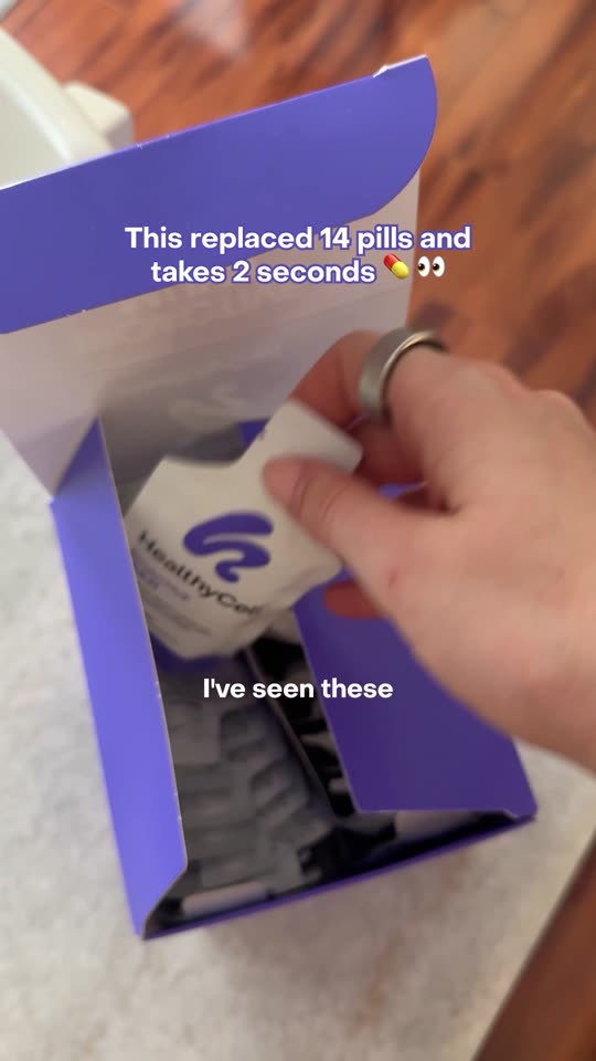 Replaced 14 Pills and Takes 2 Seconds UGC (Authentic) A UGC ad for HealthyCell whose title is a simplicity promise (14 pills replaced, 2 seconds), the kind of claim a landing page has to open on. Watch in the showcase ↗
-
 What's my Hair Type, Actually UGC (Authentic) A UGC ad for Prose framed as a question, so the page it leads to has to pick it up and answer it. Watch in the showcase ↗
-
 12 Hours Later UGC (Authentic) A UGC ad for Mandala Scrubs named for a moment rather than a product, a moment the page's first screen should stay with. Watch in the showcase ↗
-
 1 for 1 UGC (Studio) A studio UGC ad for Red Lobster with a deal in its title, where the offer itself should be the page headline. Watch in the showcase ↗
-
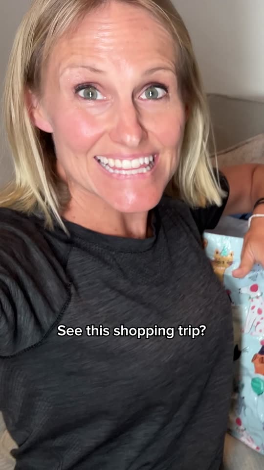 Cashback in Real Life UGC (Authentic) A UGC ad for Rakuten built around cashback, a promise the page has to explain before it asks for a sign-up. Watch in the showcase ↗
Read more
Questions people ask
What is the difference between a landing page and a product page?
A landing page is built for the people one ad brings in and opens on that ad's promise with one action; a product page serves everyone who reaches the product, from any source, and has to answer every question at once.
What is message match?
The visitor lands on the promise they tapped. Google tells advertisers that people who click an ad "expect to land on a page that's relevant to what they saw in your ad", and to make the page mirror the ad's call to action.
How fast should a landing page load?
Google's web.dev guidance is Largest Contentful Paint within 2.5 seconds, Interaction to Next Paint of 200 milliseconds or less and Cumulative Layout Shift of 0.1 or less, at the 75th percentile of page loads, mobile and desktop measured separately.
How do you know whether the page or the ad made the difference?
We test in three steps: the baseline, a new ad to the existing page, then the same new ad to a matching new page. Each step changes one thing, and each is read on purchases, revenue and ROAS.
Do you build landing pages without making the ads?
Our pages are built from the same brief as the ad, because the point is that they match. We can start from your existing ads.
Also under Commercial